Impact of Image Captions on Style Training for Stable Diffusion - 7 Experiments
Captions matter a lot! A few important observations how captions impact fine-tuning
Hello everyone,
This week we will continue our caption-related series and do experiments with art style fine-tuning and explore how captioning impacts the results.
We know we have a lot left to do with ED2.0 and face training (see last week’s post) but we got really tired looking at Damon’s face so taking a little break.
In our previous captioning post (link) we explored different approaches to generate captions. Now that we have a bit of control over that process, we decided to test how those different approaches will impact the model.
Experiment Overview
To change things up we decided to fine-tune SD on a style. Please note that this experiment is done for the sole purpose of research on the topic of captioning impact. And so, we chose to train the SD1.5 model on the amazing art of a Georgian painter Merab Abramishvili (1957-2006) link, who has a truly unique style, and Stable Diffusion models do not seem to have been trained on those paintings much (or at all). Check out Merab’s art yourself (link).
We chose 26 images, EveryDream 2.0 (link) as our tuning tool, and pretty much the exact same settings as from our face experiments (link). The only thing changing from run to run was the methodology of captioning.
7 Approaches to Captioning
We decided to get a decent range of things so here are the 7 experiments we did:
No captions, nothing as a text input, the model was trained just on images
Only the keyword (bnha). All images were named just “bnha _1”, “bnha _2” and so on.
Art by the keyword (bnha). So the images were captioned as “art by bnha _1”, “art by bnha _2”, and so on. Nothing more
Short descriptive caption +, art by the keyword (bnha). Examples: “dancing woman, art by bnha _6”, “giraffe, art by bnha _20”.
Long auto-generated caption +, art by the keyword (bnha). These captions were not adjusted, we just used whatever EDTools labeled the images resulting in quite a few not accurate captions. Example: “a painting of an old piano with a sheet of paper on the top of it and a sheet of paper sitting on top of it, art by bnha”.
Long hand-adjusted caption +, art by the keyword (bnha). Basically, quality controlled captions from #5. For example, the piano caption was adjusted to “a painting of an old piano with a sheet of paper on the top of it, art by bnha”.
Art by the keyword (bnha) + Short descriptive caption. Same as #4 but the order of a description and an activation phase were substituted to check the impact of that.
Model Evaluation Approach
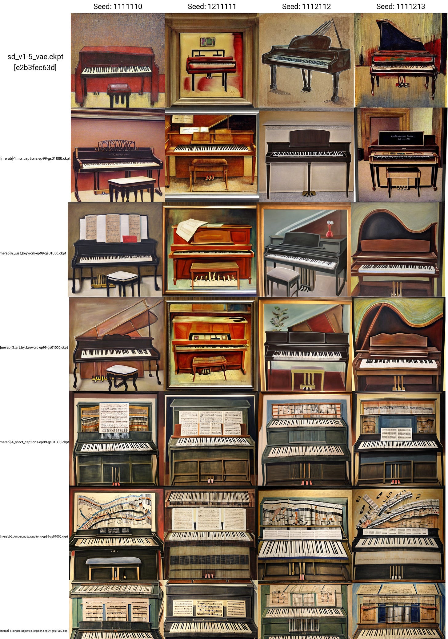
This time we changed this up a bit and took two approaches. One is the usual approach when all models are tested with the same prompt and parameters for image generation. You can see those results at the bottom of the post.
Additionally, for each image type, we gave ourselves a limit of 3 minutes per model to generate the best images and then we selected the top 4 for each. This is a less consistent approach but balances out a bit better to not punish some models on just unlucky seed numbers. The three images we tried to generate:
A woman dancing (the dataset had a few women and a couple of dancing images so this checks for consistency).
A piano (there was one painting in the data with a very distinct style).
A sloth skateboarding (there was nothing like this so we are checking for the model’s flexibility).
In the unified view, we also added images of Superman in New York for additional evaluation.
Results
Summary of Findings
Captioning matters! We got drastically different results across the board
Uncaptioned images do not do much - at least for this smaller fine-tune. Might be more interesting when doing a large training though. Also, note that this mimics ED’s Conditional dropout setting (link to doc) just at a 100% rate.
Just keyword or art-by-keyword type captions (ie no descriptive captions) lack consistency with the training data but have a lot of flexibility and can be really fun to mess around.
Inaccurate captions do worse than precise ones, even if precision means sacrificing the length and level of detail of the captions.
Moving the activation phrase to the front increases consistency but might come at the cost of flexibility.
Between short and long captions it’s hard to make definitive calls. Both feel great! The shorter ones might be more flexible while longer detailed captions might allow more consistent image generation.
With that, let’s take a look at the results of each model and discuss some details.
Performance and metrics
There was no significant difference in the total training time. The loss graphs followed each other in almost an identical manner across all seven models and the final values were very close to each other. The largest difference we noticed was that models 1-3 had slightly lower VRAM usage with spikes while models with descriptive captions had higher but stable VRAM usage.
1 - No captions
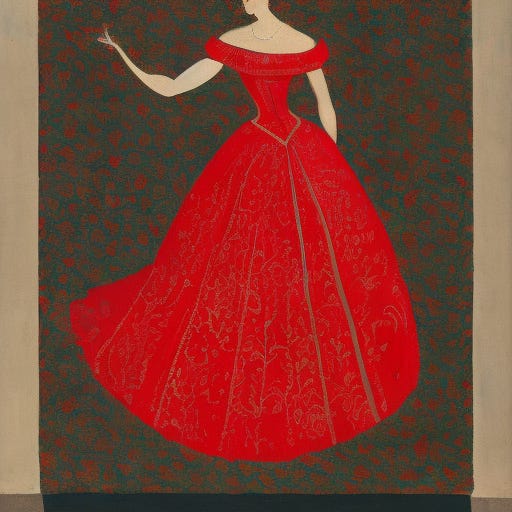


The results have a bit of resemblance given patterns but it’s minimal.


The observation was true for all three test cases and the results just felt meh.

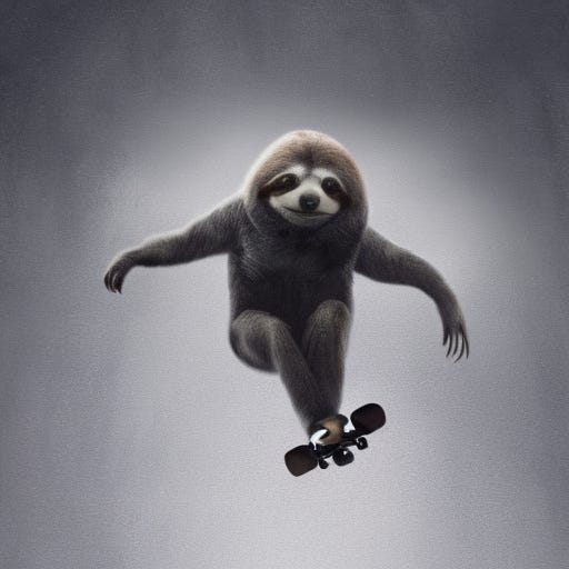


Sloth was particularly sad…
2 - Only the [Keyword]


This seems even less consistent with the original but the model has picked up some stylistic ideas.

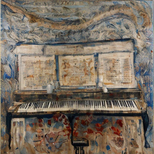
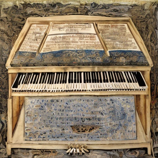

In contrast, the Piano outputs for model 2 were really fun and interesting. Not super consistent but a lot of variety with a clear trace of the style.


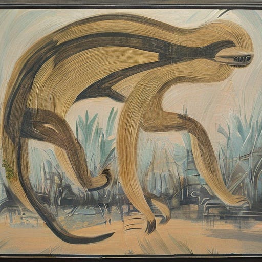

And sloth images were just fun, far from Merab’s style but cool.
3 - “art by [keyword]”


Model 3 started to look much more interesting with a lot of patter details from the data.
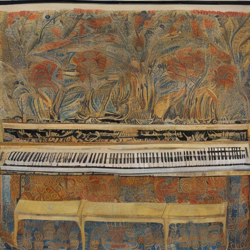


The piano results were also super cool and flexible with very clear stylistic changes.


Sloth was less impressive, just decent.
4 - Short, descriptive captions
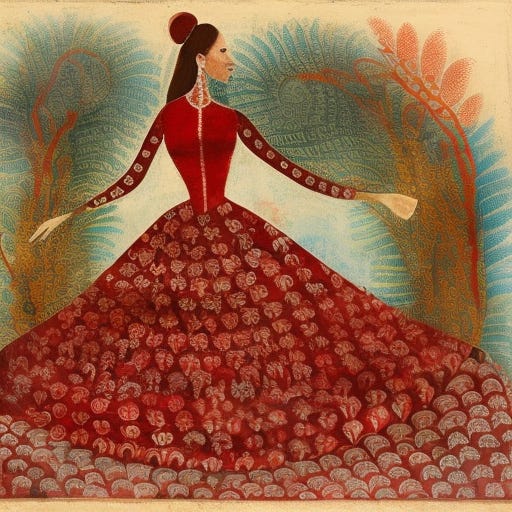


Results seem more consistent, and decent output but felt a bit less interesting.


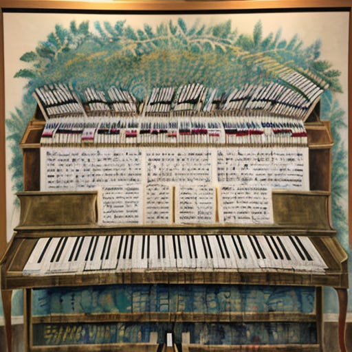
With piano, we see even more consistency.


And finally, we got some sloth images that seem somewhat like what we imagined could be achieved.
5 - Long, auto-captions

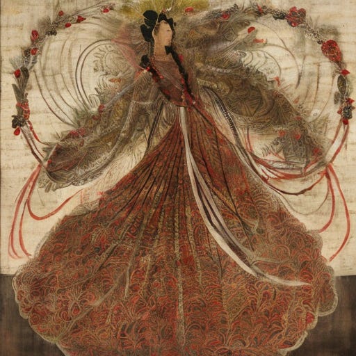


These felt like a downgrade from the short and precise captions.


however, piano results were ok. Not insanely good but decent
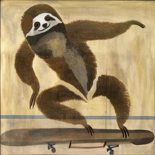


And with sloth, the model felt very hard to control, with barely any decent images in the 3 minutes limit. (but a few cute ones).
6 - Long, hand-corrected captions

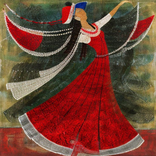
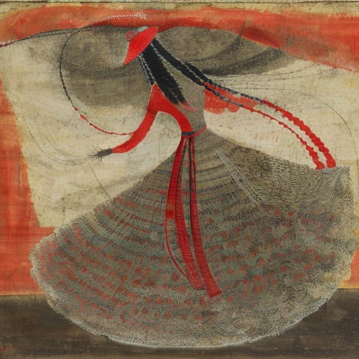

With the dancing woman, this model felt dope, in three minutes every generation looked cool and we felt like we had full control over whether we wanted to generate consistent or more creative results.
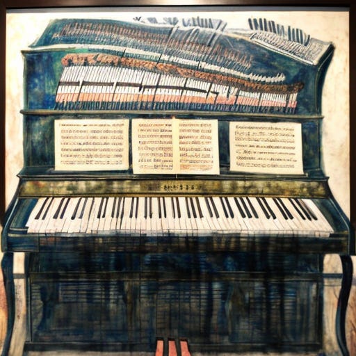


The same feeling that the model is dope was also true in the case of the piano.


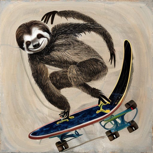
But once we got to our skating sloth, the model with long captions once again felt hard to control and not very flexible.
7 - Short Captions with Activation Phrase in Front


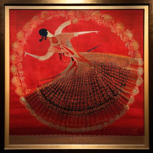

The dancing woman generation process felt dope with a very high rate of good images.


Same with the piano, felt a lot like model #6 even if the prompting style was a bit different.


But working with sloth was a bit tricky once again and we felt a lack of flexibility.


